It’s not difficult to find an article these days detailing the troubles facing the Japanese games industry. Things just aren’t as rosy as they used to be, and there’s plenty of finger-pointing as a result: budgets aren’t big enough, the cultural differences are too vast, software design methodologies aren’t properly utilized, the corporate world tends to stifle innovation, there’s a lack of outsourcing, the desire just isn’t there, etc.
While all these claims might be accurate to some extent, they’re high-level issues that no one can fix single-handedly. Instead of moping about them, I thought it might be a bit more constructive to offer some small, pragmatic advise. In a previous post I tried to do this with a certain localization issue, and now I’ll take a look an interface quirk common in many Japanese games: too many confirmation prompts.
As an example, continuing from a saved game in a typical modern title is fairly painless. Quite often a “Continue” option is the default selection on the title screen menu, and clicking it automatically loads the latest save file.
On the other hand, these are the steps required to resume my game of Resident Evil 5, one of the marquee current-gen titles developed in Japan:
- Entering the title screen menu immediately brings up a pop-up asking me to “Wait a moment…” followed by a message stating that there’s no storage device selected. This is accompanied by a “Yes/No” prompt asking me if I’d like to select one.
- Clicking “Yes” brings up the OS browser with the available options: hard-drive/memory card/the cloud. This requires me to scroll to my desired option and click it.
- Once the storage device is selected, a “Storage Device Configured” message appears along with an “OK” prompt that needs to manually dismissed.
- Following the previous prompt, a “Loading content…” message shows up and then a “Load successful.” message replaces it. This is accompanied by yet another “OK” prompt.
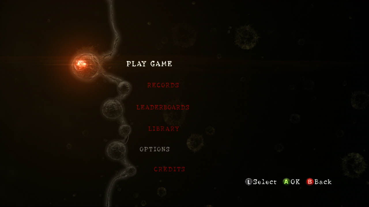
- When the title screen menu finally appears, the “PLAY GAME” option is selected by default. Clicking it takes me to the play game menu.
- On the play game menu, the “CONTINUE” option is selected by default. Clicking it takes me to an overview of the last save game.
- The save game overview displays a date stamp, the selected character, and some other miscellaneous info. It is accompanied by an “OK/Back” prompt.
- Clicking “OK” takes me to a network overview screen with various game options such as co-op settings and hit reactions. The default option is “START GAME”, and the screen is accompanied by an “OK/Back” prompt.
- Clicking “OK” takes me to a loading screen that’s quickly replaced by the inventory screen. Here the default option is “Organize” and I need to scroll down and click “Ready” to proceed.
- Clicking “Ready” brings up a confusingly labeled “Exit” confirmation with a “Yes/No” prompt. “Yes” is the default option, and clicking it finally loads my save game.
To put it mildly, this is overkill.
A large part of Apple’s success is elegantly accommodating for the most common use case. This basically means that an interface caters to the functionality that’s used most often, while the elegance comes from avoiding extraneous options, prompts, and technically-minded messages (and presenting an aesthetically appealing UI, of course).
Looking at Resident Evil 5 through this lens, the above steps could be truncated and/or altered to provide a more streamlined way of loading the latest save game.
- The “Select a storage device?” screen shouldn’t be there. Instead, the game should automatically select a default storage device, or better yet, select all the available storage devices. If none are available, a warning message could be displayed on the title screen without requiring a separate modal popup.
- The OS device-selection pop-up should only appear if the user chooses to manually change the current storage device.
- The “Storage device configured.” message shouldn’t appear. There’s no point in flooding the user with text if everything went OK. These messages should only pop up if there are errors.
- Same as above; there’s no need to display a “Load successful.” message. The transition into the save state should make it obvious that the data was correctly retrieved.
- If a saved game was found, the default options should be “Continue.” This option should immediately load the latest save game from the selected storage device. Optionally, the game could check all the available storage device and automatically load the latest save file in order to avoid any extra management on the player’s part.
- The secondary play game menu isn’t necessary if the “Continue.” option loads the latest save game.
- The save game overview should be removed as it provides non-vital information when trying to load the latest save game. Instead, this data should be presented in the load-game interface where the player browses through multiple save files. Optionally, it could also be shown on the loading screen itself.
- The network settings screen should be removed as well since it provides non-vital options that are configured at the beginning of the campaign. There’s no pressing need to change these every time the game is loaded, and this functionality could still be provided via an in-game menu.
- The inventory screen is also superfluous to loading a save game — the save data should already contain the proper equipment information. Presumably the screen is there so that the player can change their loadout following a game-over, but in that case the inventory-customization screen should only appear following the actual death. Alternatively it could also be accessible in-game from the save-checkpoint.
- The “Ready” confirmation is horribly labeled as it’s an ambiguous descriptor. Is the player exiting the inventory screen, or the actual save game loading process (it’s the first one, but it always makes me stop and think)? The prompt itself is also unnecessary, especially after the nine preceding ones.

Confirmations prompts in particular tend to be quite prevalent in Japanese titles. Of course these can be useful when it’s easy to hit the wrong button and the consequences of doing so are quite drastic, e.g., clicking the “close” button instead of the “maximize” button in a word processor after writing a lengthy, unsaved document. However, it’s rarely difficult to select the proper save-file in a game, and loading the incorrect one tends to waste only a short amount of time.
Despite this, Japanese developers seem paralysed with fear of the user accidentally selecting the wrong option. This only applies to UI-related interfaces, though; there’s no prompts for avoiding an accidental weapon-reload or putting a car into the wrong gear.
The convention also seems to be that “No” should be the default selection. I have no idea why this is the case, except to prevent the user from accidentally skipping through an important choice while blazing through a bunch pop-ups.
If that’s the assumption, then it speaks very poorly of the application flow as a whole. Perhaps the user wouldn’t be so quick to skip through these confirmations if there weren’t so many of them? And perhaps removing non-vital popups and prompts would provide a faster and sleeker way to get to the fun part of the game: the actual gameplay.
I can’t stand the yes/no popups in Japanese games. While they’re at it, they should implement better autosaving as well!
I’m amazed by how much more annoying the console UIs are than UIs for PC games, which themselves aren’t uniformly great. The Nintendo DS appealed to me because I could just close the screen to put it to sleep instead of having to start over, but it too has infuriating menus.